The ’86 logo became a staple of Mexico City design. The 2026 edition has left designers mourning a missed opportunity.
Read more Nationals get little at the start in 7-1 loss to the Pirates
The 1986 World Cup, hosted by Mexico, is one of the tournament’s most iconic editions, mostly because it served as the backdrop to Argentine superstar Diego Maradona’s infamous “Hand of God” goal.
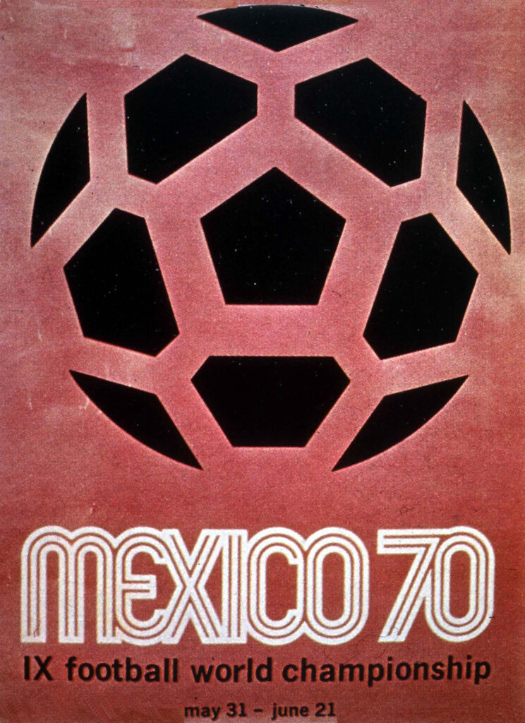
But to Mexicans — and graphic designers across the continent — the event was iconic for something else: its distinctive logo, which became an enduring symbol of Mexican design and was later voted the “greatest emblem” of any World Cup in a survey held by FIFA, global soccer’s governing body.
Forty years later, as Mexico hosts its third World Cup, alongside the United States and Canada, Mexicans and designers remember the design with nostalgia and pride. But they also wonder: Why is the 2026 logo so … bleh?
“Awful” is how Chris Creamer of SportsLogos.net, a Canadian site dedicated to the study of sports logos, described it. The art and design blog Creative Bloq simply declared that “graphic design isn’t FIFA’s passion.”
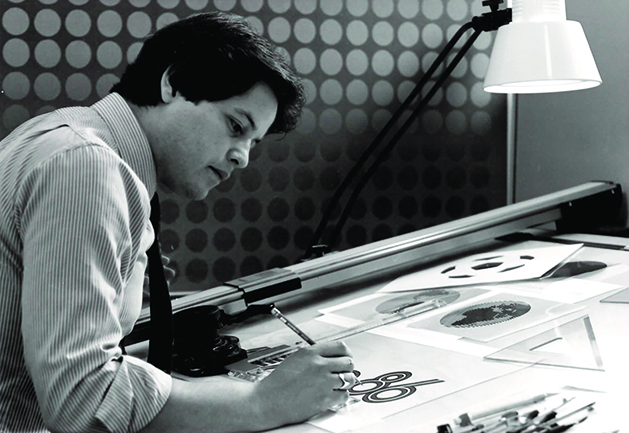
But perhaps no one is as disappointed as the designers behind the 1986 design, including Rubén Santiago Hernández, who won a logo contest as a young designer and, 40 years later, still marvels at the impact he made.
The logo was “an opportunity to create something that [would] represent the unity of these three countries coming together to celebrate a common passion,” he said.
“They missed that. It’s so corporate. They just put a 2-6, and that’s it. FIFA, that’s it.”
To understand the designers’ frustration with the 2026 design, you have to understand the legacies of the logos that came before it.
It began, in fact, with the work of an American designer, Lance Wyman, who combined traditional Mexican iconography with a minimalist design to create the 1968 Olympics logo and the icons for each Olympic competition. Wyman’s linear typography borrowed elements from patterns of the Huichol, an Indigenous people of Mexico, and were so popular the country hired him to design the map and signage of Mexico City’s metro system.
“There was a psychedelic quality to it. It expressed youth culture in a very optical way,” said Steven Heller, a former co-chair of the School of Visual Art’s MFA design program. “It was of its time, like any piece of architecture that stands out in your mind for being of a particular moment. This was the Chrysler Building of logos.”
When the 1970 World Cup rolled around two years later, Mexicans, still enamored with the ‘68 Olympics design, hired Wyman again. Santiago, a young Mexican designer who was still in school during those two tournaments, said he found Wyman’s designs “fantastic.”
“I was fascinated,” he said. “Maybe that’s one of the reasons I went into designs and arts. I just loved it.”
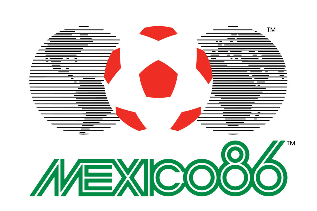
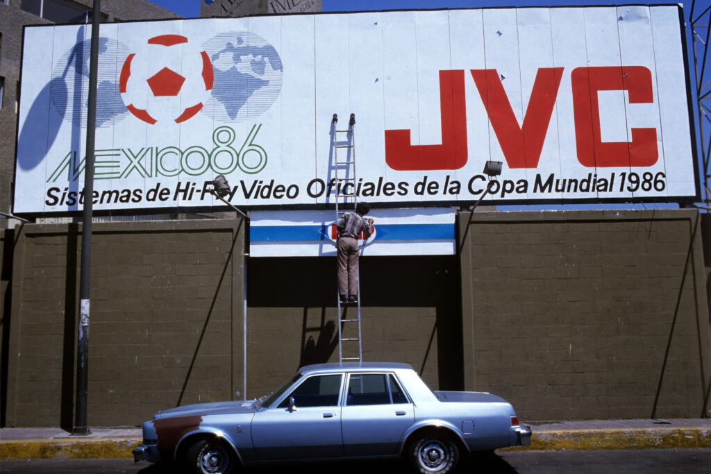
Ahead of the 1986 event, soon after the deadly 1985 earthquake that devastated Mexico City, FIFA launched a logo design competition. Santiago’s brother and father urged him to submit. He sent in four designs, including one with a red-and-white football between a split world map drawn in horizontal lines.
Underneath it, he wrote “Mexico 86″ in bold, green typography that evoked the linear typography used years before in Wyman’s designs.
“Somehow this design has caused the emotional response it has … because of the concept itself: The world united by a soccer ball,” Santiago said about the ‘86 logo.
Read more Babar Azam replaces Shan Masood as Pakistan test captain
“I wanted to [illustrate] the concept of the world united by a soccer ball, and then Mexico — because there were some divisions in Mexico because after the earthquake, there was a lot of political strife,” he said. “I wanted to represent Mexico united with the world.”
Soon enough, his lettering and depiction of soccer as a unifier of countries, and of Mexico in particular, were everywhere.
Nostalgia for that era in Mexican culture has given the Mexico ‘68, ‘70 and ‘86 logos a second life, with retailers using the typography on clothes and accessories as recently as this year. American brand Hollister used it. So did global fashion giant Zara, which slapped Santiago’s logo on a now-sold-out shirt, though not without a mistake: The design carried the wrong date.
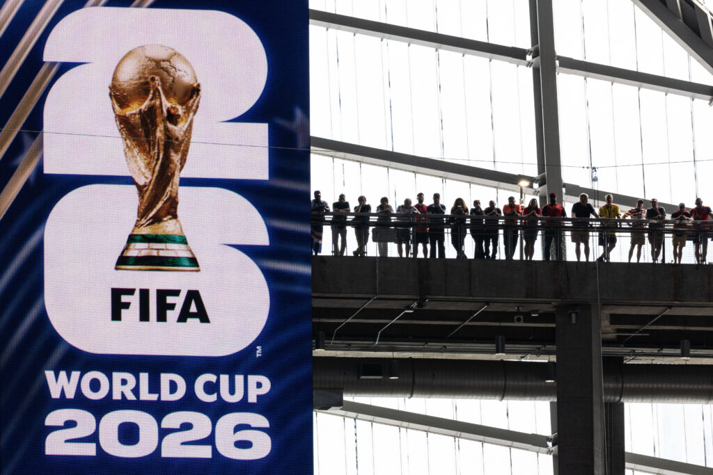
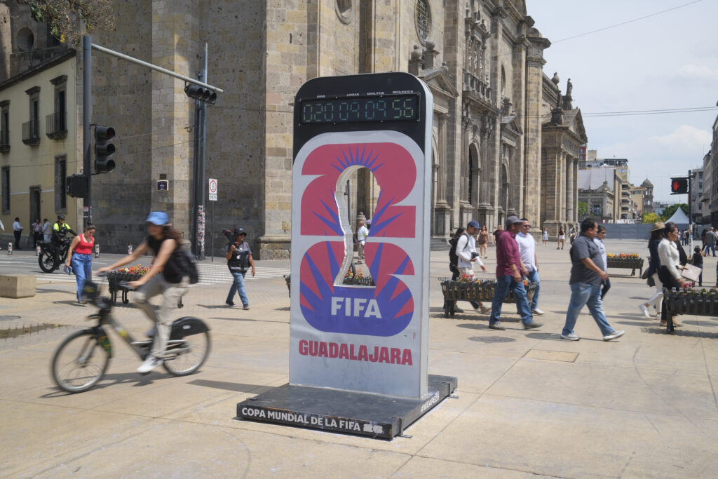
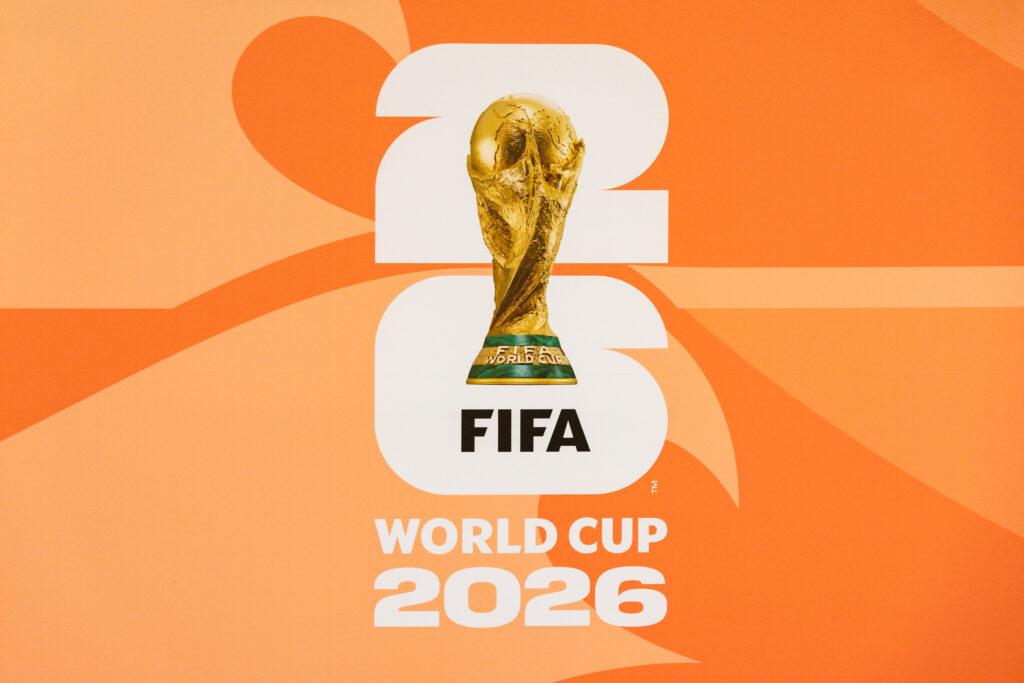
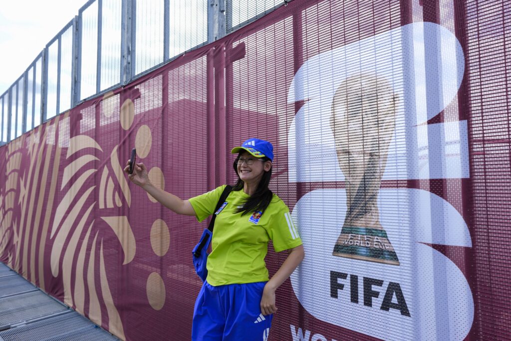
The 2026 logo is simple: There’s a blank number 2 sitting on top of a blank number 6, with a picture of the World Cup trophy layered over the two digits. It “doesn’t really emote at all,” Santiago said.
It is the first time a World Cup logo features the actual trophy on it, and none of the host countries’ colors — red, white, blue or green — is in the base design.
When FIFA first introduced the logo in May 2023, President Gianni Infantino said the “unique” branding was part of a “rallying cry” for all three host nations. Each of them, he said, would have an opportunity to “write their own page in the history books of FIFA World Cups.”
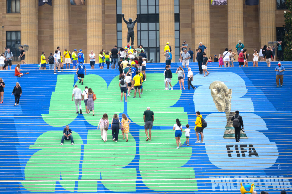
It was expected that each host city would then adapt the logo to its own cast of iconographies. But the base logo introduced in 2023 has basically remained the leading icon of the World Cup, its variants largely being photos of host city stadiums layered in the 2 and the 6.
In Mexico, fans quickly unleashed widespread criticism of the design.
“I can make it better on Paint if you want,” a user commented on X, referring to the free design software included with Microsoft Windows.
“Pinche logo, it’s horrible,” another user posted.
Heller, the American designer, said it has “no concept.”
“The Mexico ‘68 Olympics, there’s something revelatory about it, a surprise, there’s a gift,” he said in an interview. “You look at [the 2026 logo], and it’s, you know, it looks like New York taxi cab lettering.”
The typography on the ‘26 logo, Heller said, is a “very common form of art brut lettering that is happening these days, and I don’t dislike it.” But if FIFA intended to promote unity across the three host countries as Infantino suggested in 2023, Heller said, it’s doing so in a “subversive way.” So subversive, in fact, that Heller can’t find it.
When asked why his designs have remained popular in the cultural market, Santiago said it’s because they communicate “an idea rather than a trend.”
“That simplicity of the logo plays an important role, the strongest symbols are often those that can be recognized instantly,” he said.
And while the 2026 design is simple, Santiago, like Heller, said “it doesn’t have a concept.” He theorized that it hasn’t had the same impact on fans because it “is not a logo.”
“It’s a picture of this trophy with a stylized two-six in the background, but that does not make it — it makes it a photograph,” he said. “A photograph is not a logo. … It’s a moment. It’s not an icon.”
Read more Antonelli embraces British Grand Prix vibe as he takes on home heroes Hamilton and Russell